Dashboard statistics
Dashboard in the Analytics module provides you with a comprehensive overview of tenant workspace statistics, from merchant onboarding to user engagement across different target apps.
In the dashboard, a detailed statistics page for each target app is provided, which gives an overview of mini program statistics in the app, tracks different metrics, such as unique visitors (UV) and page views (PV) via line graphs, breaks down mini program sources and categories, and user sources and categories.
By leveraging these insights, you and your team can make data-driven decisions to foster growth and optimize your mini program ecosystem.This guide will walk you through each section of the dashboard, explaining the key metrics, charts, and functionalities.
Prerequisites
- Only workspace admins, developers, and operators can view workspace analytics.
- Be aware that different reports use different time zones. To identify which time zone applies to a specific report, refer to the corresponding report details sections. For further information about time zones, see Time zone: Overview.
Getting started
To navigate to the Dashboard page, take the following steps:
- Log on to the Mini Program platform.
- In the left navigation panel, choose Analytics > Dashboard.
- On the displayed Dashboard page, select a time period (1, 7, or 30 days) and a date to view statistics for that range.
Merchant Onboarding Statistics
Note: This report uses your workspace time zone. To view the exact time zone, hover over the report period displayed beside the date selector to view the tooltip.
The Merchant Onboarding Statistics section shows tenant growth by tracking onboarded merchants.
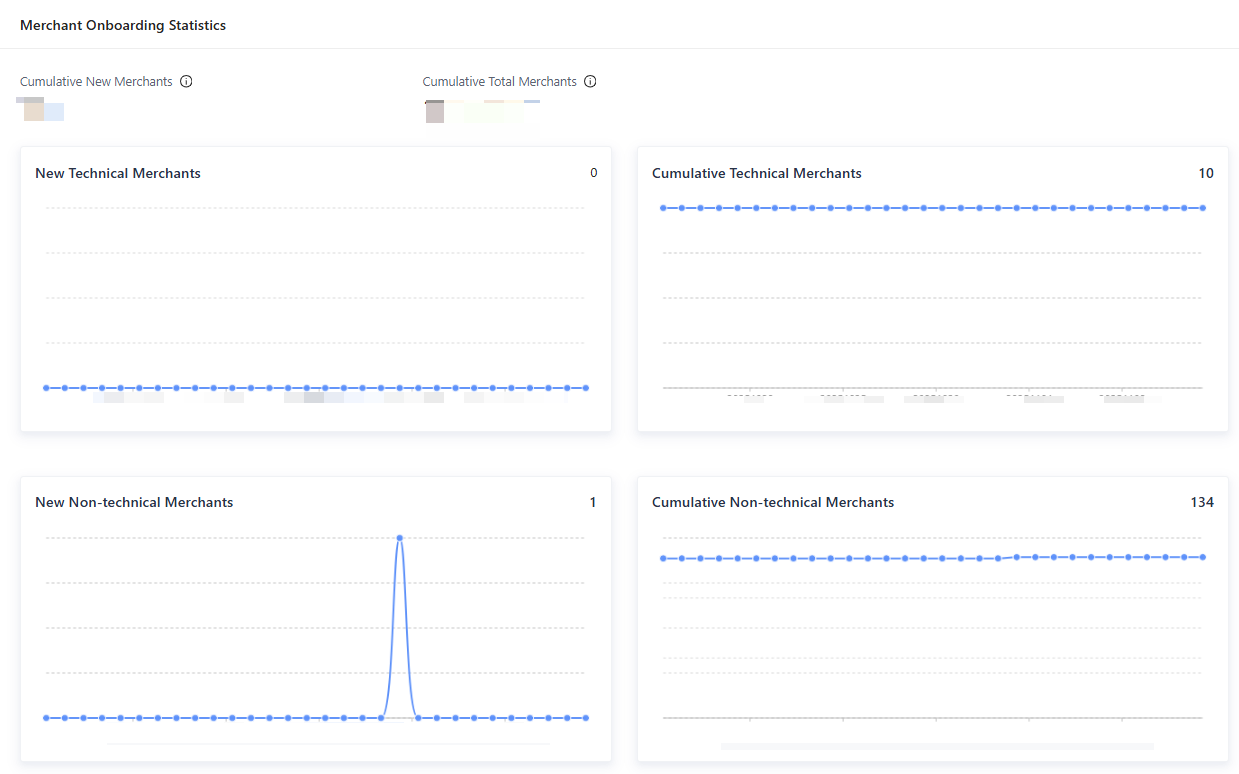
Figure 1. Merchant Onboarding Statistics
- Cumulative New Merchants: the cumulative number of newly onboarded merchants, including technical merchants and non-technical merchants.
- Cumulative Total Merchants: the total number of onboarded merchants, including technical merchants and non-technical merchants.
- New Technical Merchants: a time-series graph that shows the number of technical merchants who completed onboarding within the selected period.
- Cumulative Technical Merchants: a time-series graph that shows the cumulative number of technical merchants onboarded within the selected period.
- New Non-technical Merchants: a time-series graph that shows the number of non-technical merchants who completed onboarding within the selected period.
- Cumulative Non-technical Merchants: a time-series graph that shows the cumulative number of non-technical merchants onboarded within the selected period.
For more information, see Technical merchant onboarding and Non-technical merchant onboarding.
Target Apps
Note: This report uses each individual app's time zone. To view the exact time zone for a specific app, see the top-left corner of its card.
In the lower part of the Dashboard page, you can find the Target Apps section, which displays statistics of all the apps in the tenant workspace. This section provides a high-level overview of your entire app ecosystem, allowing you to track key performance metrics at a glance.

Figure 2. Target apps
You can sort the displayed app list from highest to lowest by the following two primary metrics.
- User Count: total users in the selected time period. This is a direct indicator of user engagement, adoption, and the overall reach of your app. An indicator shows the change from the previous period.
- Mini Program Count: total mini programs in the app during the selected time period. An indicator shows the change from the previous period.
Next to each app, a trend chart shows user-count changes for the selected period. You can also select a specific app to view its data.
For more information about apps, see Overview.
Target app details page
In the Target Apps list, click View of an app to open its details page.
Real-time Mini Program Statistics
The Real-time Mini Program Statistics section summarizes status statistics of mini programs deployed in the app. It provides an immediate, at-a-glance view of mini programs in the app.
Note:
- The numbers are real-time values, not historical data, and are not affected by the selected time period.
- You can select a category in the upper-left corner to view statistics of mini programs of the corresponding category.
- Each mini program is counted starting from the upload of the first version.

Figure 3. Real-time Mini Program Statistics
The statistics are grouped by status. The following items describe each state.
- All: The total number of mini programs associated with this app, across all states.
- Full Release: The number of mini programs whose latest versions are fully released. Mini programs that are rolled back to earlier released versions are also counted in this category.
- Grayscale Release: The number of mini programs whose latest versions are in grayscale release and are available only to a specific percentage of users.
- Reviewing: The number of mini programs whose latest versions are in one of the following states: reviewing, approved, grayscale canceled, and pilot testing completed (before grayscale).
- Developing: The number of mini programs whose latest versions are in the pre-release phase, including version uploaded, packaging, compatibility testing, and rejected.
- Inactive: The number of mini programs that have been taken offline or abandoned.
- Pilot Testing: The number of mini programs whose latest versions are currently undergoing pilot testing.
Performance Metrics
The Performance Metrics section on the details page provides a comprehensive view of your mini programs' user engagement and traffic dynamics. This area displays four core metrics: Unique Visitors (UV), Page Views (PV), New Visitors, and Lifetime Visitors.
By analyzing these metrics, you can assess user behavior, track growth, and optimize your mini program strategy.
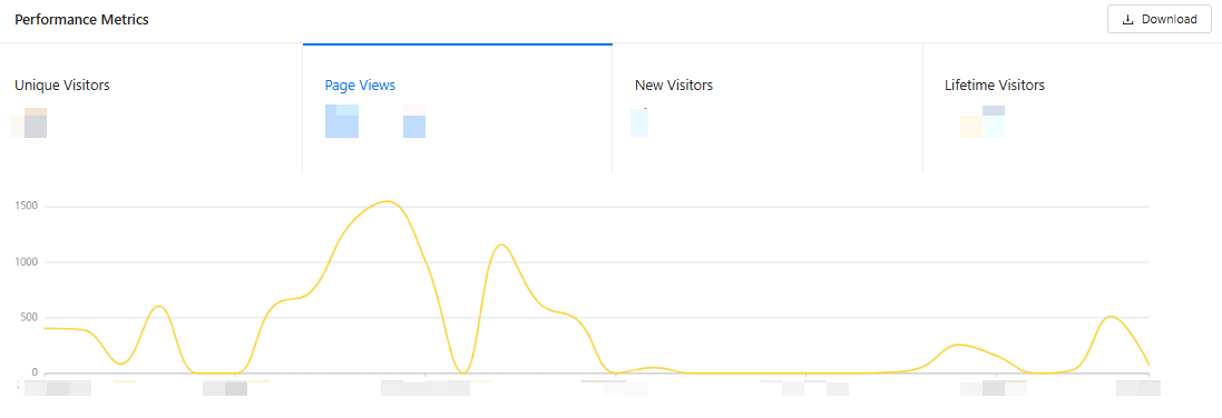
Figure 4. Performance Metrics
- Unique Visitors
- The total number of UVs who accessed the app within the selected time range. A visitor is counted once per range, even if they visit multiple times.
- This metric measures true reach. You can use UV as the denominator for ratios such as PV per visitor to gauge engagement depth.
- Page Views
- The total number of pages viewed during the selected time range.
- This metric can be used to assess engagement volume and content consumption. Paired with UV, it can also be used to monitor average views per visitor and detect changes in session depth after releases.
- New Visitors
- The number of visitors who accessed your app for the first time during the selected time range.
- This metric can be used to evaluate acquisition efficiency, campaign impact, and onboarding performance. You can compare new visitors to UVs to understand the mix of new and returning audiences.
- Lifetime Visitors
- The cumulative number of unique visitors your app has ever had since tracking began.
- This metric helps you understand your overall footprint and long-term growth. You can use it to contextualize current reach and obtain the total audience size of the app.
Note:
Take note of the following items when you use this section:
- Click the Download button to export detailed data in Excel format for further analysis.
- The chart reflects the performance of the selected time range. You can adjust the range to focus on specific periods.
- Click any metric card to load its trend in the chart below. This helps you track metric changes in the selected period.
- You can select a category in the upper-left corner to view statistics of mini programs of the corresponding category.
Proportion Breakdown
The Proportion Breakdown section on the details page provides a comprehensive view of the distribution and growth of mini programs and users across key dimensions: sources, such as the wallet, merchants, and Alipay+, and categories, such as art & design, beauty, business, and food & beverage.
This area helps you understand where your mini programs and users originate, how they are categorized and distributed, and how these proportions have evolved over time. By analyzing these breakdowns, you can identify trends, allocate resources effectively, and optimize strategies for growth and engagement.
Note:
- You can select a category to focus on a specific category.
- You can choose a time range (last 1/7/30 days) and a date from the date picker to analyze trends over specific periods.
Mini Programs by Source
The Mini Programs by Source card visualizes the origins of mini programs and their contribution to the total mini program ecosystem. You can use statistics in this card to identify which sources drive the most mini program activity and monitor the impact of different partnerships.
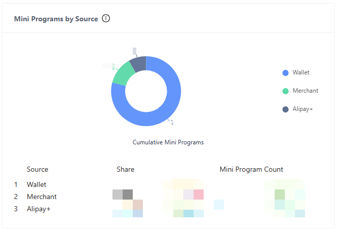
Figure 5. Mini Program by Source
A distribution chart shows the proportional share of each source. Below the chart, a list showing the detailed information of each source is displayed.
- Cumulative Mini Programs: The cumulative number of mini programs across all sources.
- Source: The specific sources of the mini programs.
- Share: The percentage of mini programs of each source. A comparison to the previous period is displayed. An upward arrow indicates growth, while a downward arrow indicates decline.
- Mini Program Count: The absolute number of mini programs of each source. A comparison to the previous period is displayed. An upward arrow indicates growth, while a downward arrow indicates decline.
Users by Source
The Users by Source card analyzes the origins of users and their distribution. You can use the statistics of this card to determine which user groups are most active or growing.
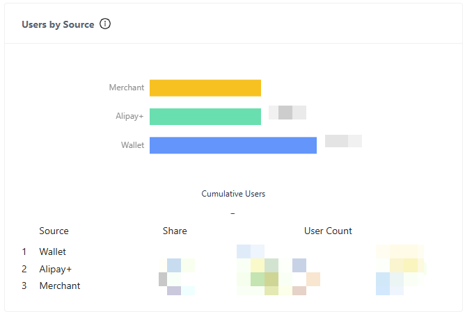
Figure 6. Users by Source
A distribution chart shows the proportional share of each source. Below the chart, a list showing the detailed information of each source is displayed.
- Cumulative Users: The cumulative number of users across all sources.
- Source: The specific sources of the users.
- Share: The percentage of users of each source. A comparison to the previous period is displayed. An upward arrow indicates growth, while a downward arrow indicates a decline.
- User Count: The absolute number of users in each source. A comparison to the previous period is displayed. An upward arrow indicates growth, while a downward arrow indicates decline.
Mini Programs by Category
The Mini Programs by Category card analyzes the origins of mini programs and their distribution across categories. You can use the statistics of this card to identify popular or underperforming categories and prioritize resource allocation for high-growth categories.
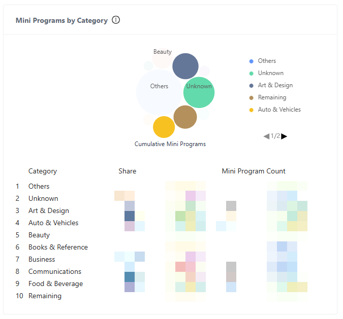
Figure 7. Mini Programs by Category
A distribution chart shows the proportional share of each category. Below the chart, a list showing the detailed information of each category is displayed.
- Cumulative Mini Programs: The cumulative number of mini programs across all categories.
- Category: The specific categories of the mini programs.
- Share: The percentage of mini programs of each category. A comparison to the previous period is displayed. An upward arrow indicates growth, while a downward arrow indicates decline.
- Mini Program Count: The absolute number of mini programs in each category. A comparison to the previous period is displayed. An upward arrow indicates growth, while a downward arrow indicates decline.
Users by Category
The Users by Category card analyzes the categories of users and their distribution. You can use the statistics of this card to analyze the distribution of users across their preferred mini program categories, align product development with user preferences, and detect shifts in user behavior.
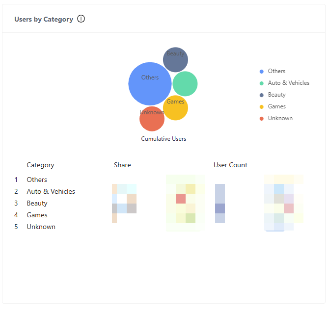
Figure 8. Users by Category
A distribution chart shows the proportional share of each category. Below the chart, a list showing the detailed information of each category is displayed.
- Cumulative Users: The cumulative number of users across all categories.
- Category: The specific categories of the mini programs.
- Share: The percentage of users of each category. A comparison to the previous period is displayed. An upward arrow indicates growth, while a downward arrow indicates decline.
- User Count: The absolute number of users in each category. A comparison to the previous period is displayed. An upward arrow indicates growth, while a downward arrow indicates decline.